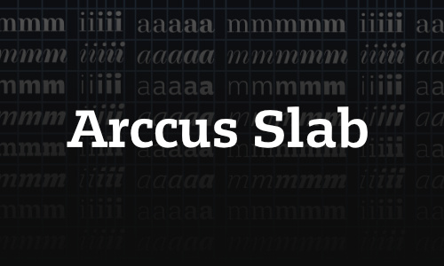
Fonts

Legit Slab

by PROF. HANS R. HEITMANN

____ Legit Slab is a distinctive text font that features both optimal readability in small sizes as well as elegant aesthetics in display use. The standout feature of this typeface is its uniwidth system: all 18 styles are 100% compatible in width and remain swappable without altering the layout. It is also compatible with our Legit families which share the same uniwidth system.

→ read more

Arccus Slab

by PROF. HANS R. HEITMANN

____ Egyptienne / Slabserif. Die Kursive zeigt optimalem Kontrast zur Geradestehenden und keine Verklecksungen in spitzen Winkeln. Fokus auf Lesbarkeit in kleinen Größen, ohne Kompromisse in der Formqualität. Gemäßigte Serifenbetonung, um Mengentext in Print und Screen zu gewährleisten. Versalsatz in Finaltypequalität.

→ read more

Komplex Slab

by PROF. HANS R. HEITMANN

____ Slab Serif (Egyptienne) im klassizistischen Stil. Die Gemeinen der Kursiv zeigen humanistische Merkmale mit optimalem Kontrast zur Geradestehenden. Der Fokus liegt, wie bei allen Fonts der Komplex-Superfamily, auf Lesbarkeit in kleinsten Größen — ohne Kompromisse bei der Formqualität.

→ read more